Loading...
Design System
Unified visual language across three brands
Warm parchment surfaces, Bodoni Moda display type, Cormorant Garamond body text, and an eight-color data visualization palette inspired by Accurat's editorial infographics and 19th-century ethnographic illustration.
Chestnut.ai·LumiLexicon·Sobrato Family Foundation
Inspiration
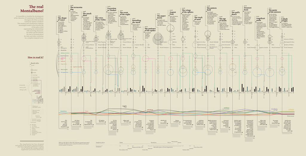
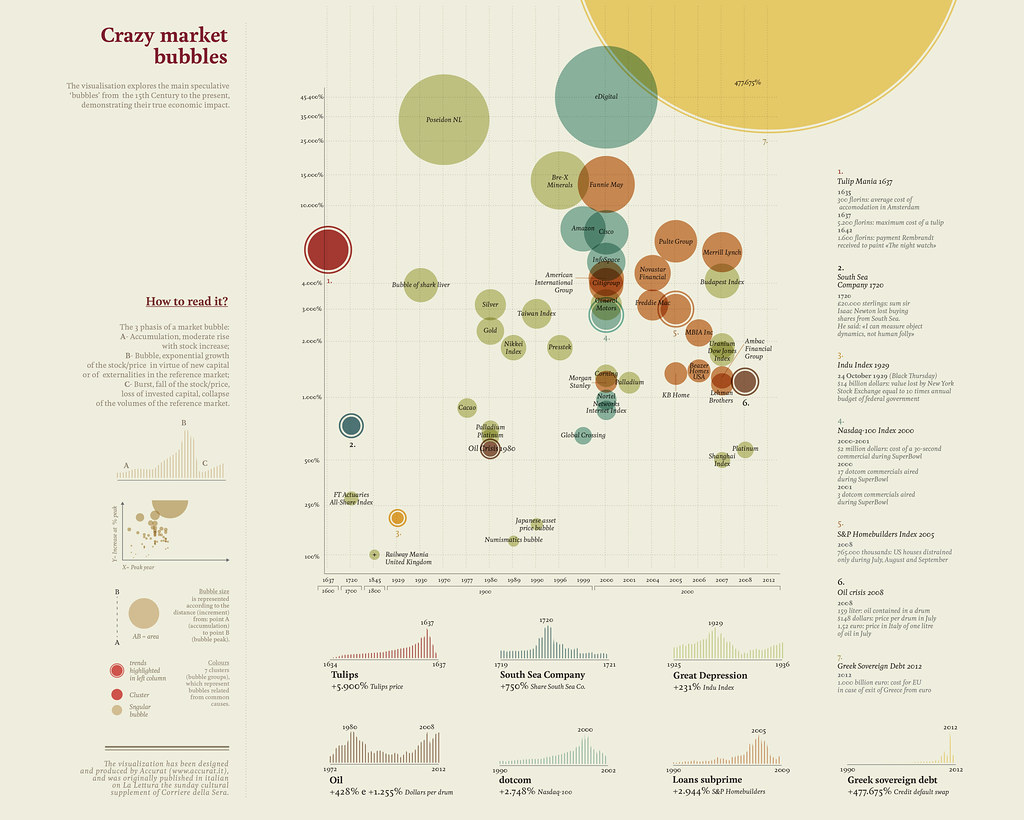
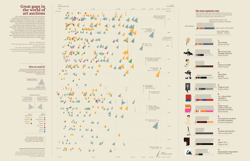
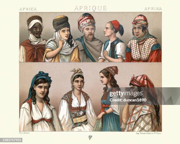
The palette was extracted from four reference images: three editorial data visualizations by Accurat studio (published in La Lettura, the cultural supplement of Corriere della Sera) and a 19th-century hand-colored ethnographic lithograph. All four share the same DNA: warm cream backgrounds, rich mixed-temperature accents, and a confidence in density that never sacrifices beauty.
Color Palette
Surfaces
Background
#F5F0E6
Page background — all three themes
from: ARB / Accurat parchment
Card
#FAF7F0
Card surfaces, elevated elements
from: Chestnut.ai card
Card Alt
#FEFDFB
Secondary card, inputs
from: Chestnut.ai
Muted
#EDE5D0
Muted backgrounds, disabled states, hover
from: Common across all three
Secondary
#E8DFC8
Section dividers, well backgrounds
from: Accurat background tint
Ink (Text Scale)
Ink 900
#1C1208
Primary text, headings
from: ARB/Chestnut — shared
Ink 700
#3A2E1A
Secondary headings
from: ARB ink scale
Ink 500
#5C4A2A
Body text, descriptions
from: Common across ARB/Chestnut
Ink 300
#9A855A
Muted text, captions, timestamps
from: ARB/Chestnut ink
Ink 100
#C8B89A
Borders, dividers, disabled text
from: ARB
Borders
Border
#C8B89A
Default borders
from: ARB border
Border Light
#D5CDB8
Subtle borders, card outlines
from: Chestnut.ai
Border Dark
#9A855A
Emphasized borders, active states
from: Ink-300
Primary & Accent
Vermeil
#8B4513
Primary action, links, focus rings
from: ARB primary — Accurat warm brown
Vermeil Light
#B05A20
Hover states, lighter emphasis
from: ARB
Vermeil Muted
#F0E0D0
Primary tint background
from: ARB
Gold
#D4A843
Accent, highlights, dark-mode primary
from: ARB/Accurat — identical match
Gold Dark
#8B6914
Gold on light backgrounds where #D4A843 is too light
from: Common
Semantic / Status
Success
#2E6B35
Success states, positive metrics, chart positive
from: ARB forest green
Danger
#B83030
Errors, negative metrics, destructive actions
from: ARB/Chestnut — shared
Warning
#D4A843
Warnings, caution states
from: Gold doubles as warning
Info
#1A3F6B
Informational, secondary data
from: ARB navy
Data Visualization (8 series)
1. Teal
#2B6777
Primary chart series — highest contrast on cream
from: Afrique lithograph match
2. Vermeil
#8B4513
Secondary series — warm anchor
from: ARB primary
3. Forest
#2E6B35
Tertiary series — natural/growth
from: ARB success
4. Coral
#C85A3A
Quaternary — warm highlight
from: Accurat/Afrique terracotta
5. Gold
#D4A843
Callouts, highlights
from: ARB/Accurat shared gold
6. Navy
#1A3F6B
Cool contrast series
from: ARB info
7. Sage
#7D8471
Neutral data, grid, reference lines
from: Chestnut editorial-sage
8. Maroon
#8B2030
Alert/negative data
from: Accurat Montalbano title red
Status Tint Backgrounds
Success BG
#EAF3E8
Success background tint
from: ARB
Danger BG
#FAECEC
Error background tint
from: ARB
Warning BG
#FDF3DC
Warning background tint
from: ARB
Info BG
#E6EFF8
Info background tint
from: ARB
Chart Palette — Light & Dark
On Cream Background
On Dark Background
Typography
Role
Typeface
Notes
Display / H1-H3
Bodoni Moda 700
High-contrast Didone. Originally from the Sobrato project, now the shared display face across all three brands.
Body Text
Cormorant Garamond 400
Elegant narrow serif at 17px / 1.6 line-height. Also from Sobrato, now the unified body face.
Chart Labels
System Sans (Inter)
Sans-serif at small sizes for chart axis labels, metric values, and tooltips.
Monospace
Space Mono 400
Code blocks, metric values, technical content.
Labels / Overlines
System Sans 600
Uppercase, wide-tracked. Consistent with Accurat's clean sans labels on warm backgrounds.
Element Styles
Property
Value
Rationale
Border Radius
4px
Crisp and editorial. Accurat uses sharp corners. Unified across all three brands.
Card Shadow
0 1px 3px rgba(28,18,8,0.08), 0 4px 12px rgba(28,18,8,0.06)
Dual-layer warm shadow. Subtle but present.
Chart Grid Lines
#D5CDB8
Warm grid matching border-light. Never gray.
Focus Ring
3px solid rgba(139,69,19,0.2)
Vermeil at 20% alpha.
Icon Library
Lucide (shared) + ARB custom SVGs
ARB keeps custom workflow icons for mobile performance. Lucide everywhere else.
Full Mockup — Light & Dark
Light Mode
Revenue Analytics
Monthly recurring revenue across all segments, with churn-adjusted forecast through Q4.
MRR
$42.5K
+12.3%
Churn
3.2%
-0.8%
NRR
118%
+4.1%
Revenue by Segment
HealthyAt RiskChurnedNew
Dark Mode
Revenue Analytics
Monthly recurring revenue across all segments, with churn-adjusted forecast through Q4.
MRR
$42.5K
+12.3%
Churn
3.2%
-0.8%
NRR
118%
+4.1%
Revenue by Segment
HealthyAt RiskChurnedNew
What Stays Unique Per Brand
Sobrato
- Shares unified fonts + palette
- Uses closest shared red (#8B2030 maroon)
- Extended SCU color families for institution-specific charts
- Standalone HTML — fonts via Google Fonts CDN
LumiLexicon
- Custom SVG workflow status icons
- Uses unified editorial theme
- Light + dark mode via shared system
- Fixed overlay layout for scanner UX
Chestnut.ai
- Full dark mode (editorial-dark)
- Matrix theme as easter egg
- Lucide icon library (75+ icons)
- Observable Plot + Recharts integration
The Journey: How We Got Here
Before unification, each project had developed its own visual identity organically. Sobrato used SCU Red and Bodoni Moda. LumiLexicon had its own “antique” theme with vermeil brown and Spectral. Chestnut.ai used an “editorial” theme that had recently been warmed from cool blue defaults. The sections below document every token across all three as they existed before merging — and what we noticed when we put them side by side.
Quick Comparison Table
Property
Sobrato
ARB
Chestnut.ai
Display Font
Bodoni Moda
Playfair Display
Playfair Display
Body Font
Cormorant Garamond
Spectral
Spectral
Mono Font
System mono
Space Mono
Space Mono
Body Size
17px / 1.6
17px / 1.75
17px / 1.75
Background
#F8F3E5
#F5F0E6
#FAF7F0
Primary
#A32035 (red)
#8B4513 (brown)
#6B3A1F (brown)
Accent
#4974BB (blue)
#D4A843 (gold)
#C9A227 (gold)
Text
#2A373F (slate)
#1C1208 (ink)
#1C1208 (ink)
Border Radius
8px
4px
4px
Card Shadow
Subtle slate
Dual-layer warm
Minimal
Destructive
#D15C3B
#B83030
#B83030
Success
#55712E
#2E6B35
(teal #2b6777)
Dark Mode
None
None
Yes (editorial-dark)
Divergence Notes
Display Fonts
Sobrato uses Bodoni Moda (high-contrast Didone), while ARB and Chestnut.ai share Playfair Display (transitional serif). These are stylistically similar but not identical.
Body Fonts
Sobrato uses Cormorant Garamond (elegant, narrow), while ARB and Chestnut.ai share Spectral (wider, more readable at body sizes). Different reading experiences.
Primary Color
Sobrato is #A32035 (SCU Red), ARB is #8B4513 (rich brown), Chestnut.ai is #6B3A1F (darker brown). ARB and Chestnut.ai are close but not identical — ARB's is warmer and lighter.
Accent Color
Sobrato uses #4974BB (blue) while ARB and Chestnut.ai both use gold — but different golds: ARB is #D4A843 (bright), Chestnut.ai is #C9A227 (muted).
Backgrounds
All three use warm cream tones but slightly different: Sobrato #F8F3E5 (warmest/yellowest), ARB #F5F0E6 (middle), Chestnut.ai #FAF7F0 (lightest/most neutral).
Chart Colors
ARB and Chestnut.ai now share the same 8-color chart palette. Sobrato has its own SCU-inspired palette with much more color variety (8 distinct hues vs. brown-centric).
Border Radius
Sobrato uses 8px (softer), ARB and Chestnut.ai use 4px (crisper). Affects cards, buttons, inputs.
Dark Mode
Only Chestnut.ai has a dark theme. Sobrato and ARB are light-only. If dark mode is desired across all three, it needs to be built for Sobrato and ARB.
Semantic Colors
Sobrato uses vibrant SCU palette colors for status. ARB has a complete system (success/warning/danger/info with matching background tints). Chestnut.ai uses editorial-specific names (teal/salmon/sage) that don't map cleanly to success/warning/danger.
● High divergence● Medium● Low
1. Font Families
Sobrato
Display / Headings
Bodoni Moda
serif · 400–900
Body / Serif
Cormorant Garamond
serif · 300–700
Monospace
system monospace
monospace · 400
LumiLexicon
Display / Headings
Playfair Display
serif · 400–900
Body / Serif
Spectral
Georgia, serif · 300–700
Monospace
Space Mono
Courier New, monospace · 400–700
Chestnut Light
Display / Headings
Playfair Display
serif · 400–900
Body / Serif
Spectral
Georgia, serif · 300–700
Monospace
Space Mono
Courier New, monospace · 400–700
2. Typography in Context
Sobrato
Display Heading
Section Heading
Body text renders at this size and line-height. Good typography balances readability with personality — serif faces lend authority while generous leading aids scanning.
Small / secondary text for captions and metadata
Label / Overline Text
LumiLexicon
Display Heading
Section Heading
Body text renders at this size and line-height. Good typography balances readability with personality — serif faces lend authority while generous leading aids scanning.
Small / secondary text for captions and metadata
Label / Overline Text
Chestnut Light
Display Heading
Section Heading
Body text renders at this size and line-height. Good typography balances readability with personality — serif faces lend authority while generous leading aids scanning.
Small / secondary text for captions and metadata
Label / Overline Text
3. Core Colors (Surfaces, Text, Borders)
Sobrato
Surfaces & Text
Background
#F8F3E5
Mission stucco cream
Card
#FFFFFF
White cards
Text
#2A373F
SCU Slate dark
Muted
#758592
Secondary text
Border
#E0DAD3
Fog
LumiLexicon
Surfaces & Text
Background
#F5F0E6
Warm parchment
Card
#FAF7F0
Light parchment card
Foreground
#1C1208
Ink-900 (darkest)
Muted
#EDE5D0
Light muted surface
Muted FG
#5C4A2A
Ink-500
Border
#C8B89A
Warm border
Chestnut Light
Surfaces & Text
Background
#FAF7F0
Warm parchment
Card
#FEFDFB
Near-white card
Foreground
#1C1208
Antique ink
Muted
#EDE5D0
Light muted
Muted FG
#5C4A2A
Ink-500
Border
#D5CDB8
Warm border
Secondary
#F5F0E6
Alt surface
4. Brand / Primary Colors
Sobrato
Brand Palette
SCU Red
#A32035
Primary accent
Bronco
#862633
Deep wine
Sky Blue
#4974BB
Secondary accent
Palm Green
#55712E
Success / nature
Agave
#4D8798
Teal accent
Agave Dark
#115D6F
Paid status
Wisteria
#7F5E9C
Purple accent
Rose
#B32551
Pink-red accent
LumiLexicon
Brand Palette
Vermeil
#8B4513
Primary brown
Vermeil Light
#B05A20
Lighter brown
Gold
#D4A843
Accent gold
Gold Dark
#8B6914
Deep gold
Gold BG
#FDF6E3
Gold tint surface
Chestnut Light
Brand Palette
Primary
#6B3A1F
Vermeil brown
Vermeil Light
#8B5A30
Lighter brown
Gold
#C9A227
Muted gold accent
Gold Dark
#8B6914
Deep gold
5. Semantic / Status Colors
Sobrato
Status Colors
Terracotta
#D15C3B
Danger / warning
Sunrise
#FFB600
Highlight / alert
Palm Light
#C6D944
Success light
Sky Light
#7BC2F9
Info light
SuccessWarningDangerInfo
LumiLexicon
Status Colors
Success
#2E6B35
Forest green
Success BG
#EAF3E8
Green tint
Warning
#7A4F0A
Deep amber
Warning BG
#FDF3DC
Amber tint
Danger
#B83030
Antique red
Danger BG
#FAECEC
Red tint
Info
#1A3F6B
Navy blue
Info BG
#E6EFF8
Blue tint
SuccessWarningDangerInfo
Chestnut Light
Status Colors
Destructive
#B83030
Antique red
Teal
#2b6777
Editorial teal
Salmon
#c84b31
Editorial salmon
Sage
#7d8471
Editorial sage
SuccessWarningDangerInfo
6. Extended / Scale Colors
Sobrato
Neutrals & Extended
Adobe
#F1E7CC
Adobe Light
#F8F3E5
Clay
#C2A98B
Clay Dark
#8E7B66
Fog
#E0DAD3
Fog Light
#EFECE9
Slate
#425766
Slate Light
#D0D5D9
LumiLexicon
Ink Scale & Extended
Ink-900
#1C1208
Ink-700
#3A2E1A
Ink-500
#5C4A2A
Ink-300
#9A855A
Ink-100
#C8B89A
Ink-050
#E8DFC8
Vermeil Muted
#F0E0D0
Chestnut Light
Ink Scale
Ink-900
#1C1208
Ink-500
#5C4A2A
Ink-300
#9A855A
7. Chart / Data Visualization Palette
Sobrato
Red
Sky
Palm
Agave
Terracotta
Sunrise
Wisteria
Rose
LumiLexicon
Vermeil
Forest
Danger
Gold
Navy
Vermeil Lt
Ink-300
Ink-500
Chestnut Light
Vermeil
Forest
Danger
Gold
Navy
Vermeil Lt
Ink-300
Ink-500
8. Card Styles
Sobrato
Sample Card
Radius: 8px · Shadow: yes
LumiLexicon
Sample Card
Radius: 4px · Shadow: yes
Chestnut Light
Sample Card
Radius: 4px · Shadow: yes
9. Buttons
Sobrato
LumiLexicon
Chestnut Light
10. Form Inputs
Sobrato
LumiLexicon
Chestnut Light
11. Spacing & Radius
Sobrato
Spacing scale (px)
4px
8px
12px
16px
24px
32px
48px
border-radius: 8px
LumiLexicon
Spacing scale (px)
4px
8px
12px
16px
24px
32px
48px
border-radius: 4px
Chestnut Light
Spacing scale (px)
4px
8px
12px
16px
24px
32px
48px
border-radius: 4px
12. Full Page Background Comparison
Sobrato
This simulates the full page feel with layered card, text hierarchy, and accent usage.
Card Title
Supporting description text
$42,500
ARB
This simulates the full page feel with layered card, text hierarchy, and accent usage.
Card Title
Supporting description text
$42,500
Chestnut Light
This simulates the full page feel with layered card, text hierarchy, and accent usage.
Card Title
Supporting description text
$42,500
13. Icon Systems Comparison
Chestnut.ai uses 75+ Lucide icons. ARB uses custom SVG paths for workflow states. Sobrato uses no icon library (inline SVG only).
Chestnut.ai
Library: lucide-react (75 icons)
Consistent stroke-based icon set. 24px default, 1.5px stroke.
Navigation
Data & Analytics
Financial
Status & Feedback
AI & Tech
Time & Scheduling
Communication
Content & Files
Actions
Theme
People & Infra
LumiLexicon
Library: Custom SVG paths (10 status icons)
Hand-crafted SVG paths for book workflow states. No external icon library.
Workflow Status Icons
acquired
Plus — new acquisition
researching
Magnifying glass — under research
researched
Check-circle — research complete
priced
Dollar sign — price set
listed
Clipboard — listed for sale
sold
Shopping cart — sold
shipped
Truck — shipped out
personal_library
Open book — kept for collection
bulk_dispose
Cube — bulk disposed
donated
Heart — donated
Media Controls (Video Scanner)
Rewind
Pause
Play
Utility Icons
Camera
Lock
Check
Design Note
ARB deliberately avoids Lucide to keep bundle size minimal for the mobile-first scanner workflow. Custom SVG paths are ~200 bytes each vs. importing the full icon library. Status icons use semantic colors tied to workflow state.
Sobrato
Library: None (inline SVG only)
Standalone HTML page. Icons are minimal — only a download icon repeated 3x.
All Icons Used
Download
x3 instances
D3.js Chart Elements (SVG-generated)
Bar charts, distribution plots, and map markers are all generated programmatically by D3.js and Leaflet — not from an icon library.
Design Note
Sobrato is a standalone static HTML page with no build system. Icon usage is intentionally minimal — the editorial/data-journalism style relies on typography and color rather than iconography.
Icon Divergence Summary
Library
Chestnut.ai = Lucide (75 icons), ARB = custom SVG (10), Sobrato = none (1 inline)
Stroke Style
Lucide uses 1.5px stroke, 24px viewbox. ARB custom SVGs use 2px stroke, same viewbox. Visually compatible but not identical weights.
Color Approach
Chestnut.ai icons inherit from CSS (currentColor). ARB status icons have semantic colors per workflow state. Sobrato is hardcoded stroke color.
Opportunity
ARB's 10 status icons could be replaced with Lucide equivalents (Plus, Search, CheckCircle, DollarSign, ClipboardList, ShoppingCart, Truck, BookOpen, Package, Heart) for visual consistency — or kept custom for intentional differentiation.
14. Design Inspiration & Reference Links
Curated sites that share our warm palette DNA, editorial typography, or data-heavy layouts. Grouped by what they teach us.
North Star References
These sites validate our entire approach — warm backgrounds + serif type + dense data
Financial Times↗Chestnut.ai
The gold standard. Their salmon-pink background (rgb 253,241,230) is nearly identical to our parchment. Every chart, metric, and data table sits on this warm base and looks authoritative.
Learn: Background treatment on charts, serif headline pairing with clean data, muted accents on warm surfaces
FT Visual Vocabulary↗All three
Open-source chart type reference from FT's data team. Shows how to categorize visualizations by purpose (deviation, correlation, ranking, distribution, change over time).
Learn: Chart type selection framework, editorial approach to data storytelling, clean labeling practices
A publishing imprint with warm, literary digital presence. Cream-adjacent backgrounds, sophisticated layout that treats content like a curated bookshelf.
Learn: Editorial typography hierarchy, warm neutrals for backgrounds, marriage of digital and physical product presentation
The Pudding↗Chestnut.ai
Visual essays that make data journalism editorial and immersive. Each piece is a standalone design exercise with scroll-driven data storytelling.
Learn: Scroll-driven data narratives, letting visualizations carry the story, balance of density and whitespace
W.E.B. Du Bois Data Portraits↗All three
Du Bois's 1900 charts used hand-drawn elements with bold colors on parchment backgrounds — reds, golds, and browns. Our EXACT palette, from 125 years ago. Won a gold medal at the 1900 World's Fair.
Learn: Historical proof that warm-palette data visualization works beautifully. A modern toolkit exists for recreating the style digitally.
Color & Data Visualization Theory
How to make warm palettes work for charts — the science behind the aesthetics
Deep analysis of how FT, NYT, Economist, and others choose chart colors. Includes the sepia-tone approach for historical data.
Learn: How to adapt chart colors for non-white backgrounds, categorical combos that work on cream
Practical guide on choosing beautiful (not just functional) colors. Critical for our challenge of making brown and gold distinguishable on cream.
Learn: Ensuring sufficient lightness variation between colors, not just hue variation
Validates serif fonts in charts. Notes that The Guardian uses serif for all chart labels, and Our World in Data pairs Playfair Display with Lato.
Learn: Serif fonts "look more classy, traditional, and serious/professional" — supports our Playfair Display / Spectral choice
Data Visualization Society journal on warm-to-cool mapping in sequential palettes. Warmer colors (reds, yellows) represent lighter values.
Learn: Framework for sequential scales using our reds (#A32035) through golds (#D4A843) to creams
Observable: Crafting Data Colors↗All three
Interactive notebooks for testing colors in actual chart contexts. See your palette in plots, text, and marks simultaneously.
Learn: Testing methodology to validate browns, golds, and greens maintain contrast on cream backgrounds
8-color system: 3 neutrals for structure, 3 rich hues for categories, 1 warm accent, 1 cool accent. Features earthy browns and ochre.
Learn: Swap their grey base for our cream and the formula maps directly to our system
Brown/beige palette for financial dashboards with hex codes (#8d6e63, #a1887f) very close to ours. Proves brown/gold dashboards project trust.
Learn: Deep browns for structure, gold for highlights/active states, light cream backgrounds, dark brown text
Editorial & Luxury Design Patterns
How prestigious brands and publications handle warm palettes at scale
The Economist Visual Style Guide↗Chestnut.ai
Formal style guide for one of the most respected editorial data publications. Demonstrates visual consistency across chart types.
Learn: Chart consistency rules, color for emphasis vs background, how a style guide ensures coherence
Mailchimp UX Data Patterns↗Chestnut.ai
Editorial-style data visualization with predefined categorical color combos optimized for accessibility. Warm, retro-leaning brand palette.
Learn: Categorical color combos for charts, accessibility-first palette design, brand warmth in data interfaces
Patek Philippe↗Sobrato
Heritage luxury brand with cream backgrounds, serif typography, and gold accents. Presents detailed technical information in elegant editorial format.
Learn: Technical detail with editorial grace, gold/cream pairing, serif typography for prestige
Giorgia Lupi: Data Humanism↗All three
"A warmer depiction of data can make people relate." The philosophical basis for our approach — warm data viz is a communication strategy, not just aesthetics.
Learn: Intellectual framework for why warm data visualization works, organic shapes, texture overlays
Archive of 18th-19th century data visualizations including Playfair's originals. The charts that invented the bar chart and line graph were brown and gold on cream.
Learn: Primary source for the antique aesthetic. Engraving style, crosshatching, decorative cartouches
ProPublica: Design Principles for News Apps↗Chestnut.ai
Design principles from a top data journalism org. Focuses on making complex data accessible regardless of color palette.
Learn: Hierarchy of information in data-heavy layouts, typography rules for data apps, guiding the reader's eye
Tools & Browsable Galleries
Hands-on tools and galleries for finding specific solutions
No-code visual editor for shadcn/ui themes. Supports Tailwind v4, exports CSS variables. Stone and Taupe bases are closest to our cream/parchment.
Learn: Build warm palettes visually with live component previews, export exact CSS variables
Awwwards: Data Visualization↗All three
Award-winning data viz websites — live and inspectable with browser dev tools, not just mockups.
Learn: Production-quality warm-palette data sites you can actually inspect CSS on
9,000+ data visualization dashboard designs. Search for specific chart-type challenges in warm palettes.
Learn: How specific chart types (waterfall, funnel, heatmap) look in brown/gold/cream
Behance: Data Dashboard Projects↗All three
Full case studies with wireframes and design rationale, not just final shots.
Learn: Decision-making process behind color choices — the why, not just the what
Curated gallery of real websites using brown/warm palettes — artisanal, heritage, and luxury brands.
Learn: How brown-dominant palettes pair with cream backgrounds, balancing warmth with readability
99designs: Gold Website Inspiration↗ARB + Sobrato
Collection of real websites using gold as primary or accent color.
Learn: How gold signals prestige without feeling gaudy, gold on cream vs gold on dark, serif + gold combos
Practical warm palette combos with hex codes. "Warm Sand" and "Chocolate Truffle" palettes map closely to our themes.
Learn: Specific hex combos for warm palettes, balancing richness and subtlety, pairing rules
Technical guide to building systematic color palettes — generating tint/shade scales from base colors.
Learn: How to generate tint/shade scales, maintaining consistency across light/dark modes, accessible contrast within warm palettes
Recommended Chart Color Order on Cream Backgrounds
Based on contrast analysis from the resources above:
1. Primary series
Forest green — highest contrast on cream
2. Secondary series
Navy — strong contrast, cool complement
3. Tertiary series
Red accent — warm, high visibility
4. Highlight/callout
Gold — attention-drawing, not primary data
5. Neutral/grid/axis
Brown at reduced opacity — ties to theme
6. Area fills
Very light tints (10-15% opacity) of each
Design System · Chestnut.ai · Built with Claude