Loading...
← Back to projects
AI-Generated Google Slide Deck
Fully Automated Presentation Pipeline
Claude Code + Google Slides API17 Slides, Zero Manual EditingCSV → Analysis → Charts → Deck
The Premise
An unhappy client claims revenue is down since switching medical billing providers. Two CSV files — a benchmark period and three months of new data — need to become a polished, branded presentation with charts, analysis, and actionable recommendations.
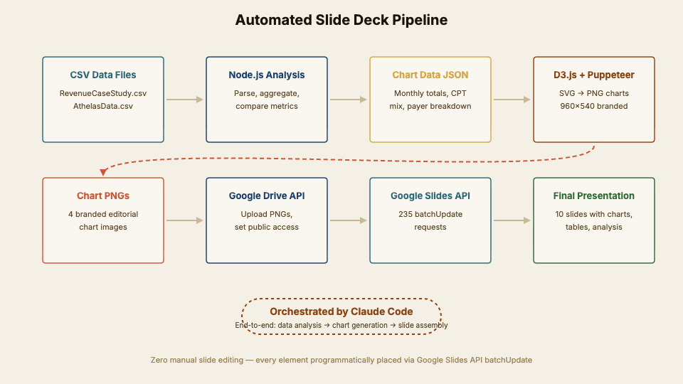
Instead of building slides by hand, I used Claude Code to orchestrate the entire workflow: parse the CSVs, run the analysis, generate D3.js charts server-side, render them to PNGs, upload to Google Drive, and assemble every slide element through the Google Slides API. Not a single slide was manually edited.
The pipeline is reusable — swap in different CSVs and branding, and it produces a new deck. This is less about the specific case study and more about proving that AI can own the full loop from raw data to finished deliverable.
Live Presentation
Use arrows to navigate. Open in Google Slides
What the Data Revealed
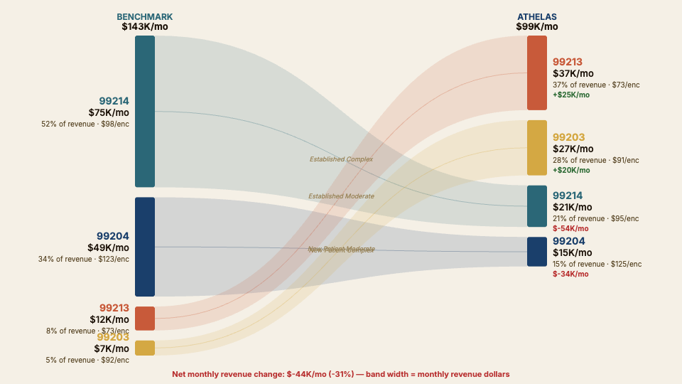
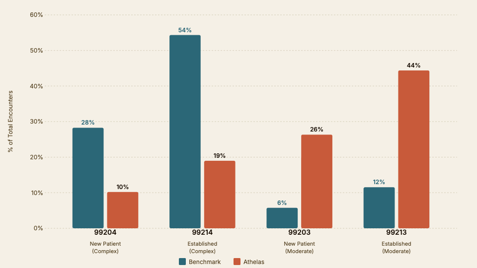
Revenue dropped 30.7%after the transition — but the root cause wasn't collections or payer contracts. It was a CPT code downshift: the practice went from billing mostly 99214 (established complex) visits to 99213 (established moderate), cutting per-encounter revenue by a third.
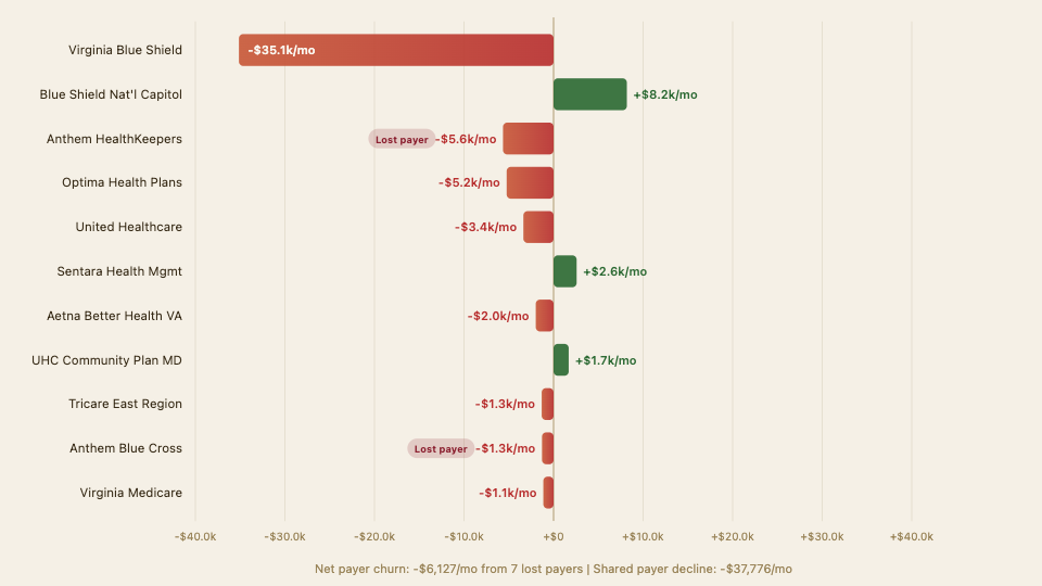
Seven insurance payers from the benchmark period are completely absent in the new data, suggesting credentialing gaps worth investigating.
-30.7%
Revenue Decline
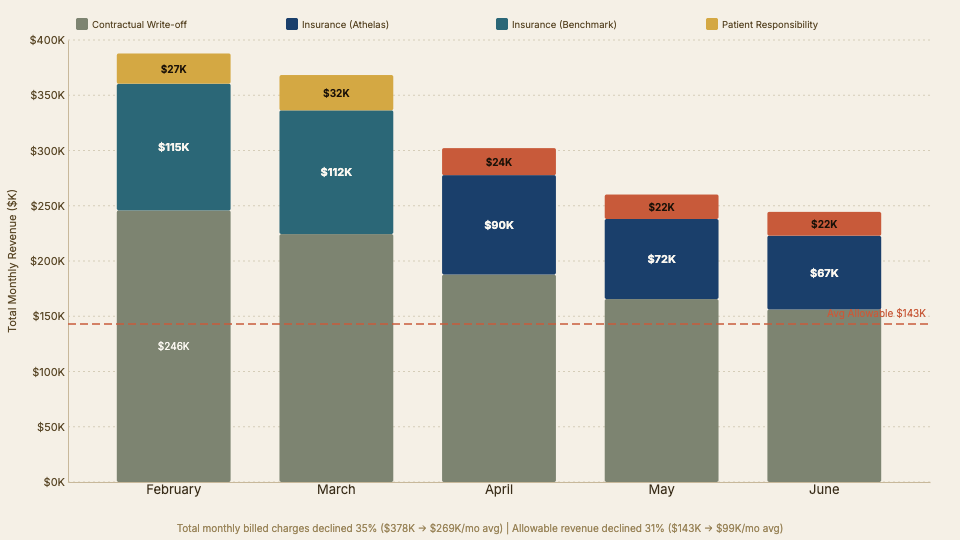
$143K/mo → $99K/mo after transition
-19%
Encounter Volume
1,406 → 1,139 encounters per month
54%→19%
CPT 99214 Drop
Primary driver: coding downshift, not collections
7 payers
Missing Insurers
Absent in Athelas data — potential credentialing gaps
~37%
Collection Rate
Comparable across both periods — billing efficiency stable
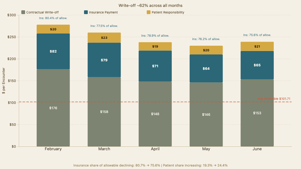
~62%
Write-off Rate
Consistent — payer contracts are not the problem
The Pipeline
Every step — from CSV parsing to final slide placement — was orchestrated by Claude Code. No manual slide editing, no drag-and-drop, no copy-paste. The pipeline processed 6,230 encounter records into 17 branded slides with 900+ Google Slides API requests.
A data integrity bug was caught mid-build: JavaScript's split(',')corrupted dollar amounts with commas ($1,250.00 → broken). Python's csv.DictReader saved the day.
Automated Pipeline Steps
1
CSV Data Files
RevenueCaseStudy.csv + AthelasData.csv — 6,230 encounter records across 5 months
2
Python Verification
csv.DictReader for accurate dollar parsing (JS split(',') corrupted comma-formatted amounts)
3
Node.js Analysis
Aggregated monthly totals, CPT code mix, insurance payer breakdowns, denial rates
4
D3.js + jsdom
Server-side SVG chart generation — waterfalls, Sankey diagrams, bar charts, all branded
5
Puppeteer
Headless Chrome rendered SVGs to 960×540 PNGs with dark-mode branding
6
Google Drive API
Uploaded chart PNGs with public access for slide embedding
7
Google Slides API
900+ batchUpdate requests built every slide element programmatically
8
Final Deck
17 slides, zero manual editing — every element placed by code
Generated Charts
All charts were generated server-side using D3.js with jsdom, rendered to PNG via Puppeteer, and uploaded to Google Drive for slide embedding. Each chart uses the unified editorial design system — parchment backgrounds, warm Accurat-inspired palette (teal, vermeil, coral, gold), Inter typeface for labels.
Automated pipeline: CSV → Analysis → Charts → Google Slides
Sankey diagram: revenue flow by CPT code, benchmark vs Athelas
Revenue waterfall: billed → write-off → insurance → patient, per encounter
Total monthly revenue waterfall across all five months
CPT code mix shift: the primary driver of revenue decline
Insurance payer mix: revenue impact by payer
Tools & Technology
The stack is intentionally simple — Node.js scripts orchestrated by Claude Code, with D3 for charts and Puppeteer for rendering. No frameworks, no build systems, no slide design tools.
Technology Stack
| Tool | Role |
|---|---|
| Claude Code (Opus 4.6) | AI orchestration — wrote all scripts, managed the entire pipeline end-to-end |
| Node.js | Runtime for data analysis and chart generation scripts |
| D3.js + jsdom | Server-side SVG chart generation (11 chart types) |
| Puppeteer | Headless Chrome: SVG → PNG at 960×540 |
| Python csv | Data verification after discovering JavaScript parsing bug |
| Google Slides API | Programmatic slide construction (900+ API requests) |
| Google Drive API | Chart image hosting with public access |
Built entirely in the terminal with Claude Code.